
GALLERY
Please do not touch the exhibits while you are here.
All statements taken from multiple interview sources
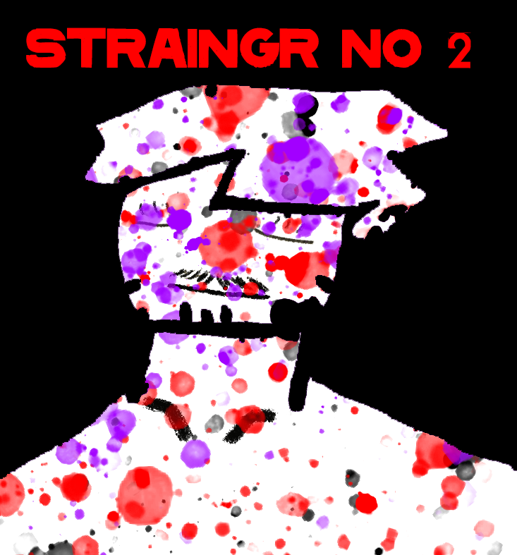
with works from STraingr no. 2
Index
THE KINGS
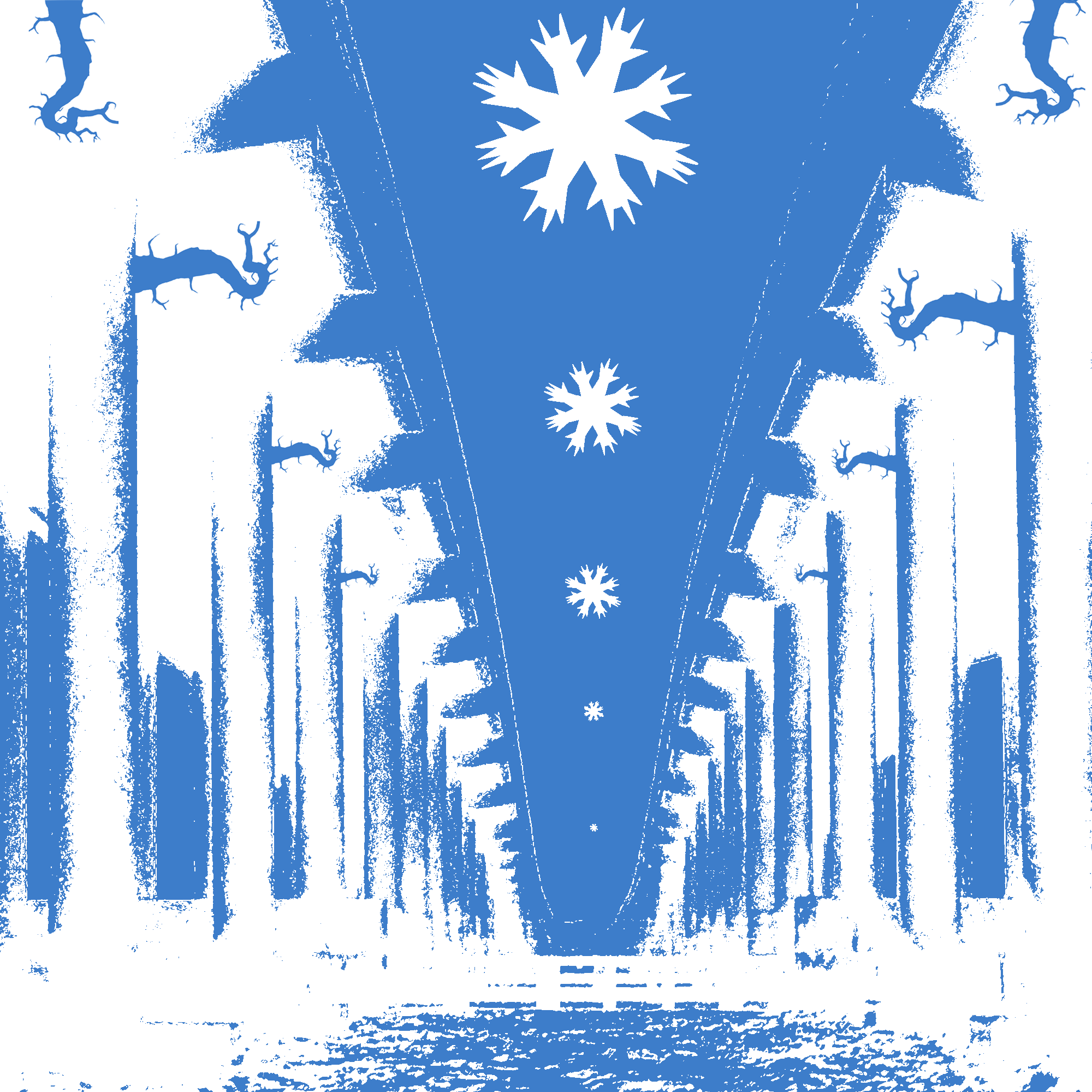
THE KING OF SEA
I see a building. Some psycho took a paint roller and went around splashing blue on everything. He had a point, sure. but i don’t really get the hand snowflakes or the twisting tendrils. But i do get it. I am the man with the paint roller. - Straingr No.2
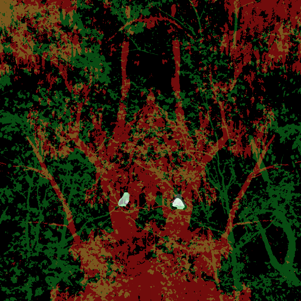
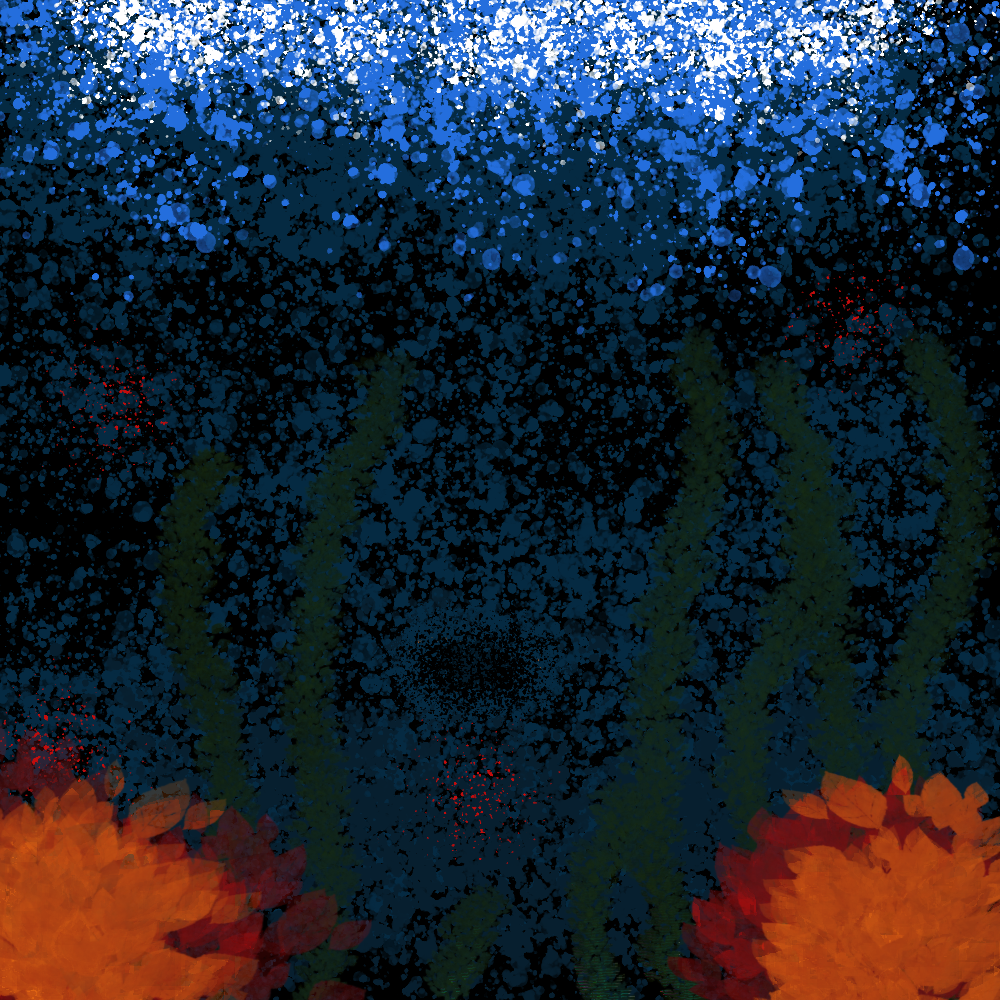
THE KING OF THE FOREST
MAny times i have looked to nature for inspiration. Twigs really do create shapes out of nothing. It’s really just plants growing, but i get more out of it. I paint the wood red and turn them to each other. -StrainGR No.2
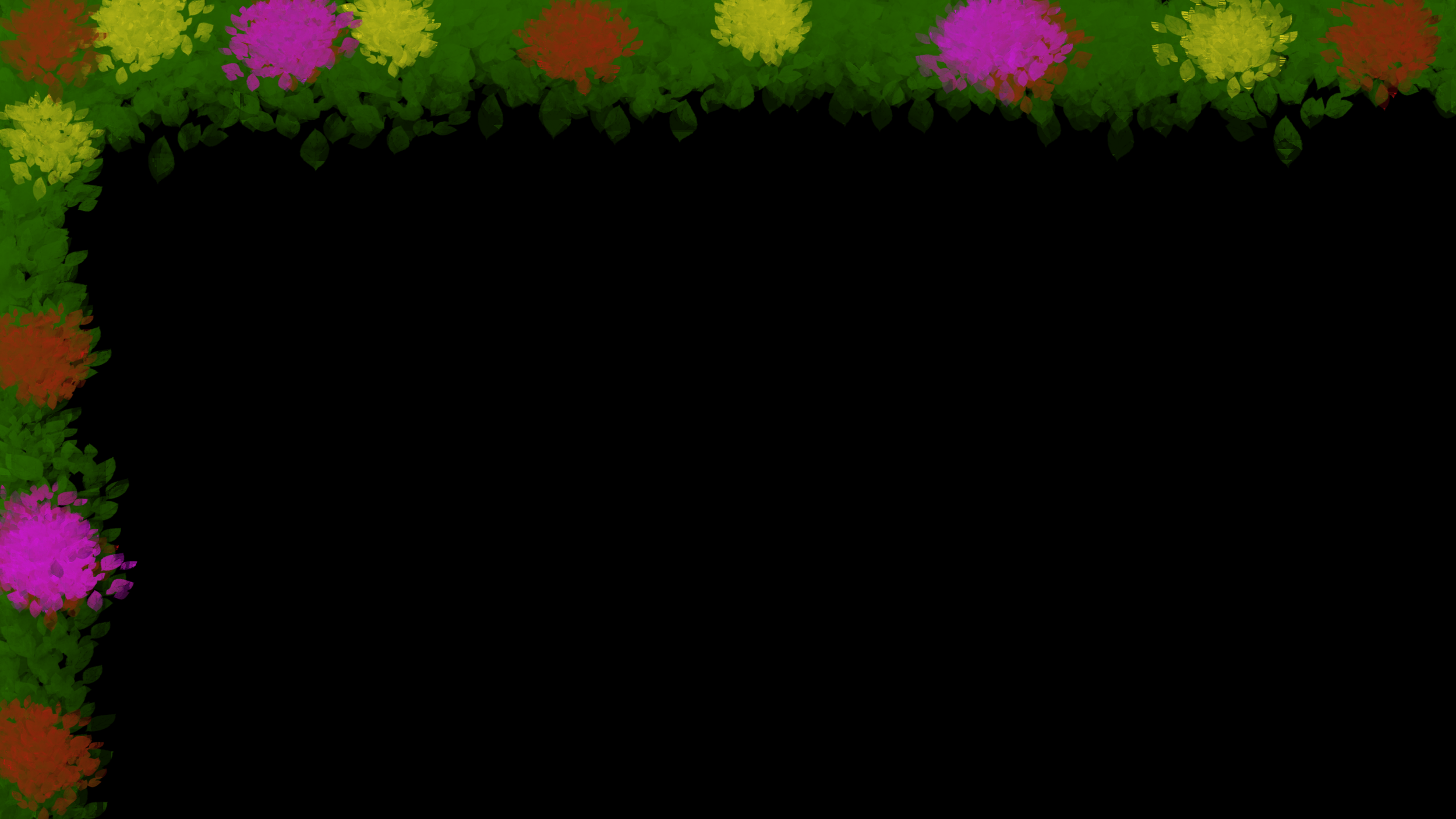
Nature in Bloom

WIERD FISHES
IT WAS ONE OF MY FIRST USING a splattering technique. I was really proud with the white foam on top and the blues slowly darkening. I feel like the radiohead refrence is most obvious with this one. I was listening to them right before I made it. My King series came from a similar moment, just less obvious.- Straingr NO. 2
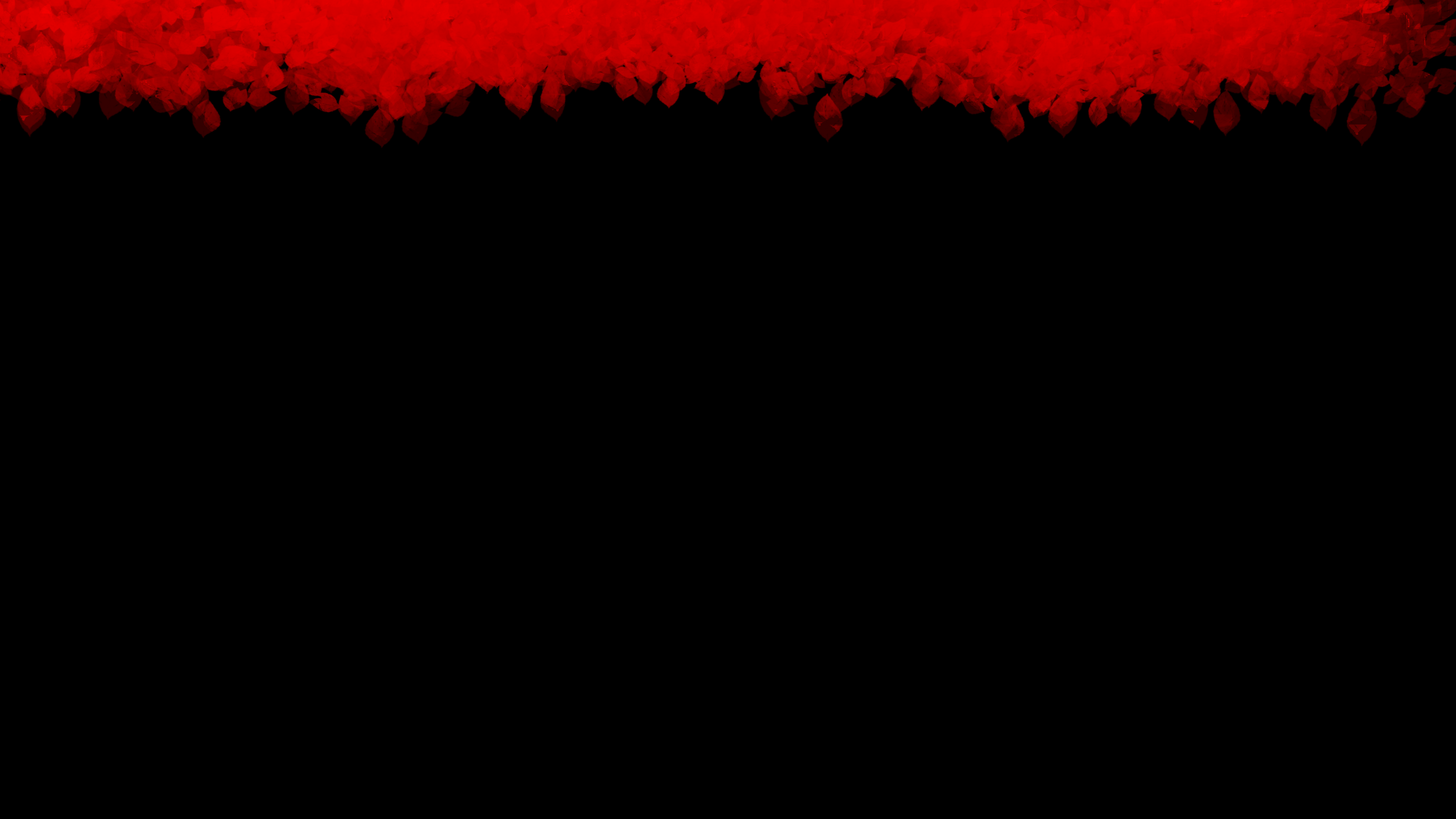
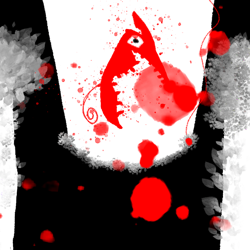
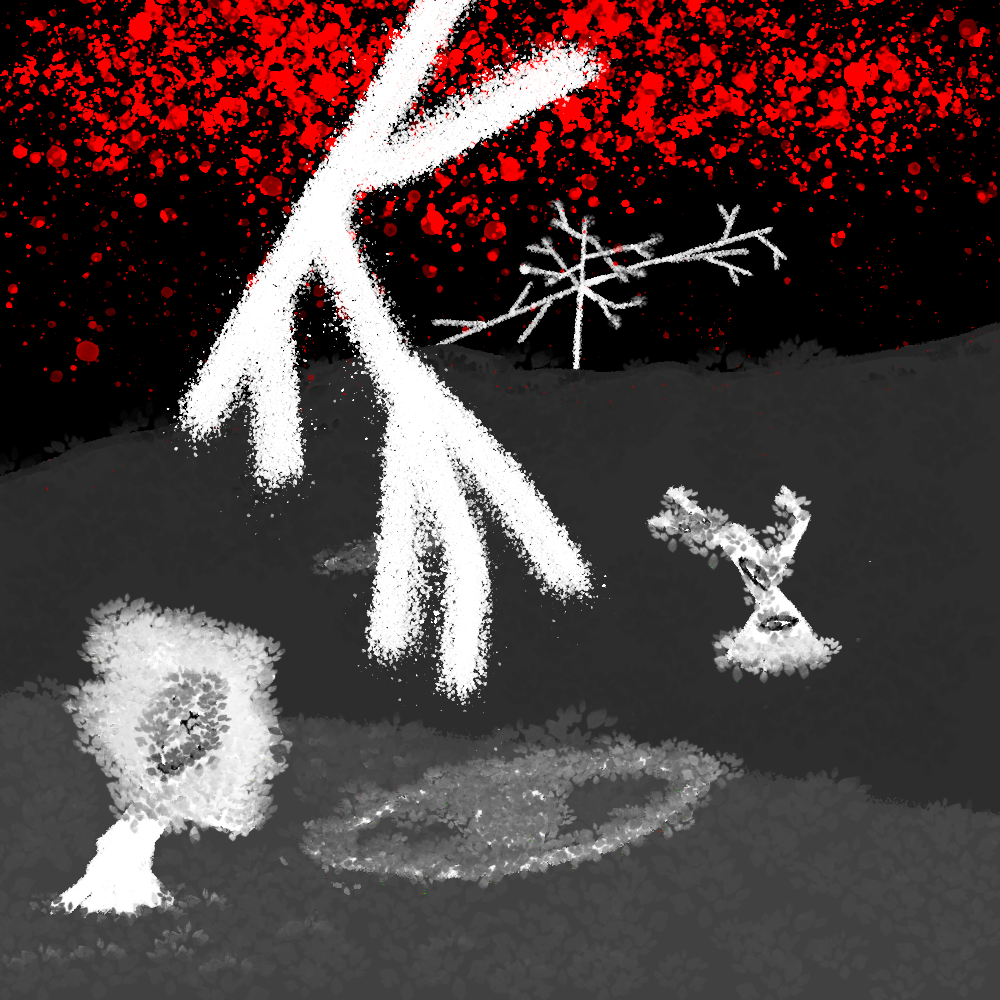
BLEEDING OUT
MOST OF MY ARTISTIC PROCESS IS INCiDENTAL, at least I think it is. This started because i had some decent photos of trees in my phone. I had actually used the side trees for an earlier piece, “THROUGH THE LOOKING GLASS.” The fact that the red backdrop layered onto the white tree bleeds onto it was accidental, and i love it. - Straingr No. 2
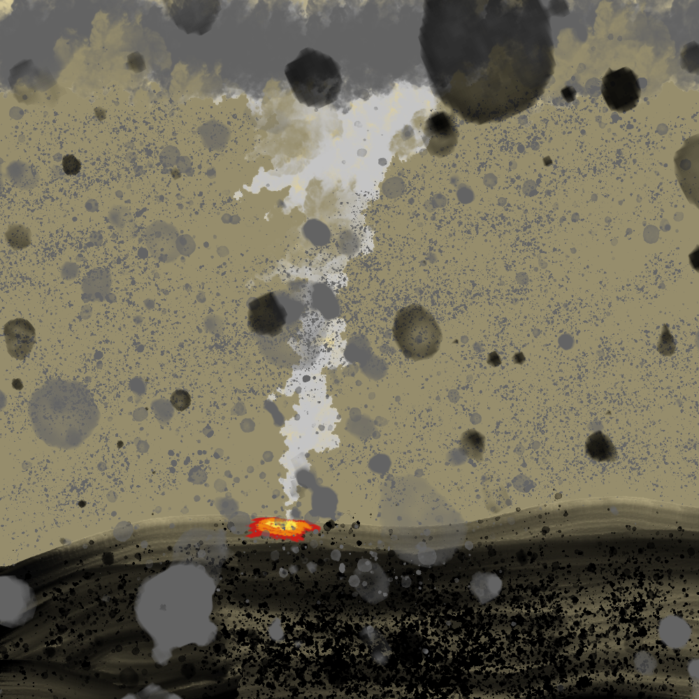
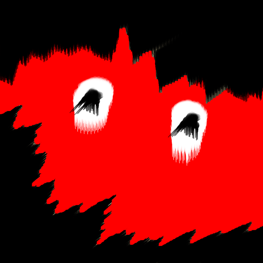
WORLD ON FIRE
Many times when i have opened my art program, i have tried to make the kid a album cover. it was only after i learned how it was produced did i realize i was far from being albe to make it. i am no stanley donwood. However, when i finished this, what i see is the behind the scenes of that album. like what lies just beyond the pale blue and ashen gray skies? this, this is what i imagine the world looks at that point.- STraingr No.2
SPACE
EVERYTHING
I was really obsessed with the concept of space at the time, in both senses of the word. I really liked playing around with the stars and heavens sure, but also the idea of a space. A physical environment which we add context to by existing. Sometimes i think we get so caught up in the endlessness of space along with it’s size we forget that space, all of it, it’s all real and if you had the necessary materials, you could step on and discover all of it. but thats nothing more than speculation on my part.-Straingr No. 2
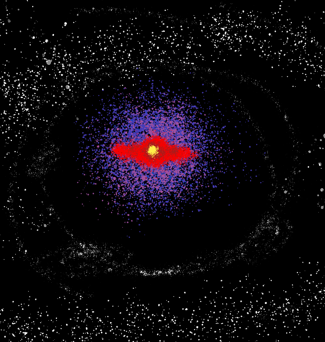
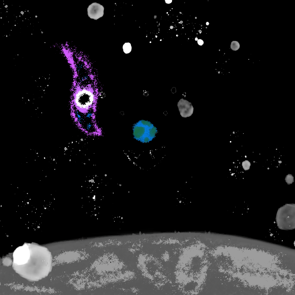
GALAXY TORN
MOST OF MY first draft ideas have been space. Its definetly because i keep using black as a background color, and if it’s not that then it’s something in the ocean. I picked out gray and felt that a piece reflecting someone’s view on the moon while the comsos are active was somewhat compelling. I’ll definetly come back to this idea and certainly refine it.- STraingr No.2

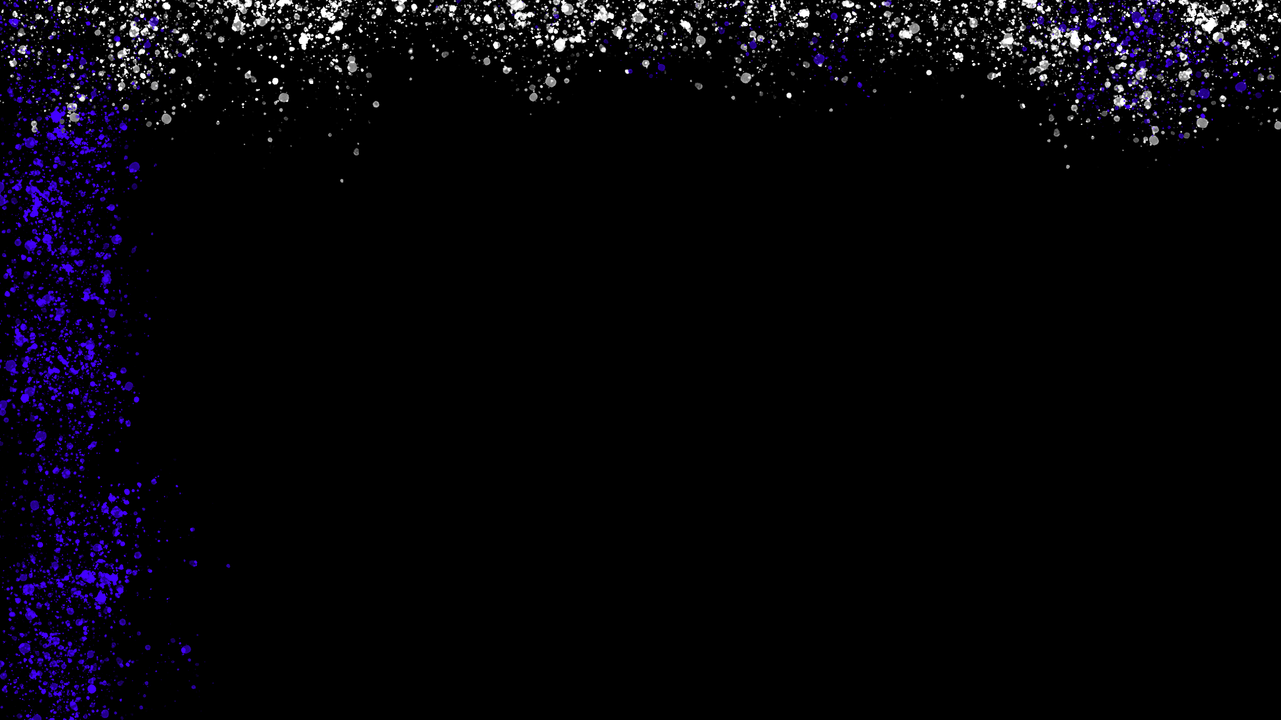
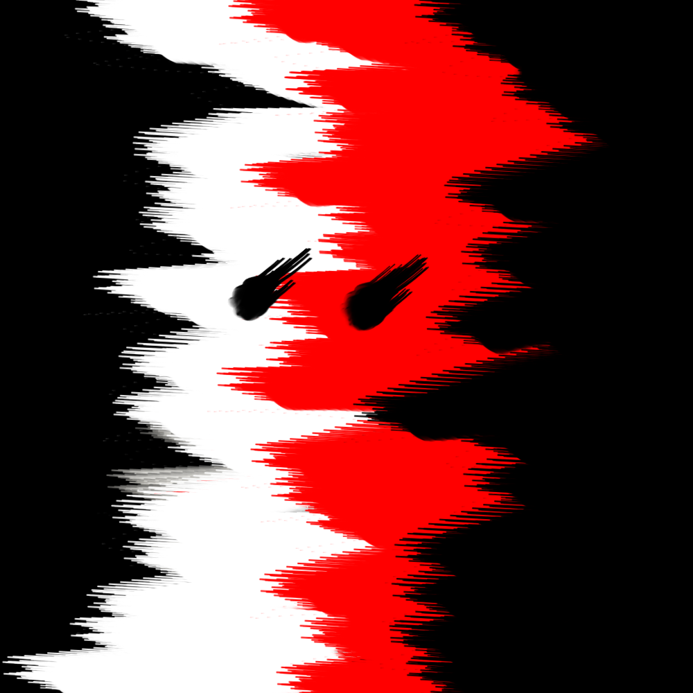
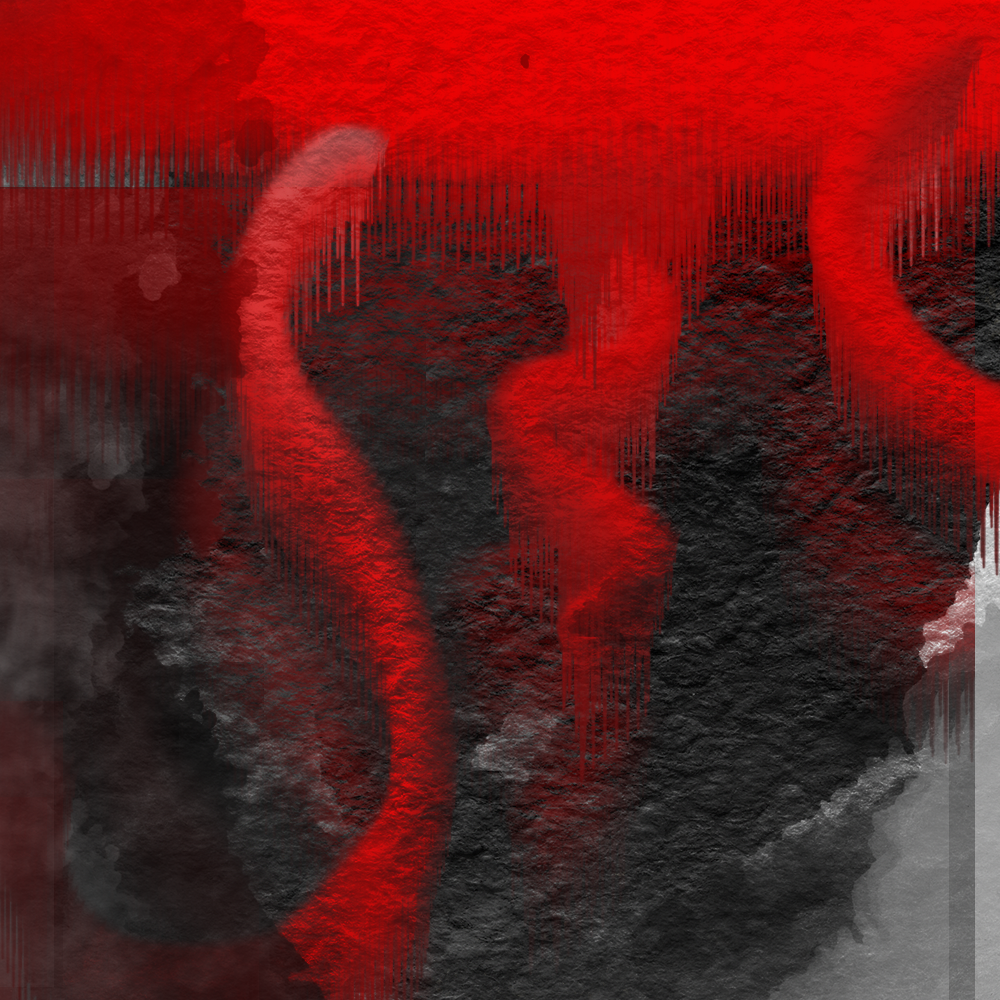
+WHITE+RED
ONE OF MY more sporatic series. No DESCRIPTIONS or titles PISS OFF.-STraingr no. 2

Continue
SELF PORTRAIT
I’ve made many attempts at a self-portait and many times have i hated it. the proportions weren’t right or the general vibe was just off. This time i feel like it captures more than the previous. It was really only after that i realized it looks like a poor imitation of the bends album cover. You could say that the radiohead refrences are one too many, but i feel that it honestly reflects me. -STraingr No.2